
Warning: this is gonna be a rant.
I haven’t really done rants on this blog yet, but suffice it to know that I actually do it quite often. Every season, there’s always a show or two that just doesn’t meet up to your standards, but every now and then there’s that one show that is just so amazingly bad that it manages to even be offensive. The last show I remember that reached that magnitude of awfulness was Kuma Miko back in Spring 2016… The culprit this season is none other than Occultic;nine.
And there are many reasons to hate this show — from its highly convoluted premise, to its heavy reliance on conspiracy theories turned chuunibyou-technobabble nonsense — but if there’s one thing to absolutely despise in this show, it’s the god awful cinematography and composition.
And I think I have enough experience in Photography (having grown up under the tutelage of a serious hardcore film camera-weilding father) to say that none of the compositional sense in this show makes… er, sense. Although the sensibilities in still photography and cinematography may differ, they share the same principles in basic framing and composition. Heck, just look at the mess of shots there are in this show!
To be honest, I was thinking of making a more informative article on how composition and framing has allowed anime to achieve a unique sort of visual expression that makes it uniquely “anime-ish”. It’s these same principles that have created the visual effects we call “bullet time” and “fly-by animation”, which in themselves were inspired by manga. It’s also for that reason that I believe anime as a term isn’t simply limited to the origin of the work — rather, it’s a larger paradigm of composition and framing that allows for a more vivid expression of artistry that cannot be encapsulated by the terms cartoons or animations alone.
But then there’s this piece of trash. It almost makes everything I’ve come to know and respect about anime seem like a joke. And don’t get me wrong — the artistic detail and contrast of rotoscoped backgrounds (meaning they were traced from real-life backgrounds) with half-sketched characters makes for a flavorful visual feast… but this is ruined by outlandishly terrible composition. It’s like someone made a wonderful soufflé, only to piss all over it and call the golden shower a “spray of lemon”.
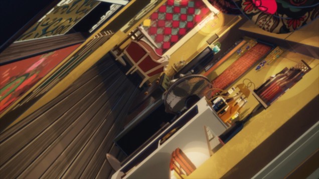
First off, there’s all of this tilted perspective. What does this achieve? What is the evocation in this sort of framing? Are you creating a sense of unease? Or are you simply trying to make the viewer hurl? Tilted perspectives have been a tool used in lots of eroge in order to fit an entire shot of the character within a single frame given the landscape nature of the screen (there was a slightly different issue back when the standard format of screens were 4:3, but I digress). Tilting also works when you want to create a stilted psychological headspace — indicating that there’s an instability or awkwardness in the situation that causes the camera to have a similar feeling of unease. It’s a shared experience between the viewer and the device that allows for “viewing”. When those two aren’t met, you get this piece of nonsense, like a 90-degree rotation that makes you feel like you left you iPhone on “lock orientation”.

In fact, anything beyond 30 degrees off the horizontal axis looks totally bizarre. And you can argue that perhaps that’s what the show was going for, but titling the camera and making the shot last for just a fraction of the second is sorta self-defeating. What exactly is being conveyed in the shot above? A third of the shot is an empty wooden desk, and the orientation makes you have to second-guess what the heck you’re looking at. Is that a that a lamp or a space invader in a blazing ball of fire? Yeah, I might be exaggerating, but think of it this way — the last time I ever saw the world from this perspective was when I was facedesk-ing myself out of frustration. Is that what the show is telling me? I think it is. It’s a metaphysical joke that I should be banging my head on the desk at this very moment.
And then there’s the awkward use of negative space. When this is combined with the excessive titling of the frame, it makes objects of focus seem insignificant. In this frame, I’m drawn to the buildings in the background. And then I’m sort of annoyed by the obstruction in the foreground, then the pieces of paper on the table stick out terribly in contrast to the darker backgrounds… This shot is just pure eyesore. And I’m not even stating the fact that these two are blabbering about at 100 words per minute with random indecipherable engrish words like “ascension” or whatever the heck that’s supposed to mean.
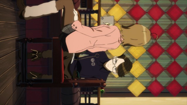
But this is perhaps the one shot that made me lose my marbles. I mean, this sort of compositional exaggeration is typical of anime, but it doesn’t suit the compositional tone at all. This was supposed to be a reveal — it’s a serious moment. Why are you shrinking the character as if creating a super deformed element? Now you could argue that it’s because it’s making him “smaller” compared to the girl, who’s sorta talking him down at that point in the scene, but this sort of composition requires a prior setting — a precedent — that allows the viewer to accept such compositional cues as “acceptable”. And that’s what I mean by “tone”. It’s like throwing in a sunburst during a Jason flick out of the blue. You certainly can do it, but that doesn’t mean that it should happen. Likewise, this sort of compositional form didn’t make sense when it appeared. In fact, it confused me more than portrayed whatever the heck it was gunning for.

I mean, just look at this? Did Ryo-tas just turn into a titan or something? The composition is just so messed up, and there’s no distinction from the framing that this is actually a symbolic representation of psychological dominance of one headspace over the other. There’s just no clear distinction between what is compositional artistry and blatant disregard for basic rules of framing.
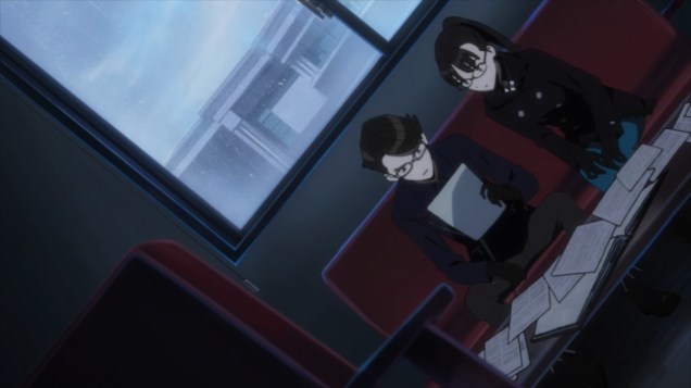
And the surprising thing is that all of these shots were taken from just a single episode of this god-forsaken show. Holy shit!
So yeah, I’m quite frustrated at how this show turned out. It’s one thing to have an incomprehensible storyline — it’s another to have a totally incomprehensible “world view” that doesn’t even allow for any insightful depiction of its characters. If anything, you NEED to be able to present your characters sensibly without having to resort to exotic framing that just distracts the viewer from watching. You might as well have blindfolded people if the visuals are just that difficult to digest. But in the end, I’m aware that some people might not be as sensitive than me with regard to compositional rules and appropriate framing. And in other ways, it could be totally the opposite — like how I enjoyed the cinematography in any given Sunday, whilst my dad found it abhorring. But what’s seen cannot be unseen for me in this case. Congratulations occultic;nine — you’ve achieved the worst cinematography in an anime for the year.
[end rant]

~.~ No exaggeration: I got dizzy just by looking at the tilted screenshots in your post.
LikeLiked by 1 person
Oh, you had already written your rant when I responded to your comment. My mouth tastes like foot now.
I’m actually even more impressed you endured this show for so long. Those screenshots look terrible.
LikeLiked by 1 person